
Making ticket booking faster, clearer, and less frustrating
Redesigning the UTS ticket booking experience to
reduce friction in navigation, login, and ticket generation.

Role
UX Designer
Duration
1 Month
Tools
Figma , FigJam , Maze
The Challenge
UTS is the Indian Railways app that let people book unreserved train tickets from their phone to avoid standing in a station queue. The project involved identifying usability issues, simplify the booking journey, and redesign key interactions to reduce friction and improve clarity.
Impact
9 → 4 steps
booking dropped
85.7%
task success rate
4.2/5 → 4.8/5
Projected rating jump
Design Approach
Discovery
01
Primary Research
Gathered user insights through surveys and interviews with daily commuters.
Secondary Research
Analyzed app reviews, community forums, and competitor apps to validate key pain points.
UX Audit
Evaluated the existing booking experience to identify usability gaps and opportunities.
Define
02
Research Synthesis
Synthesized research into recurring behavioral patterns and user needs.
Problem Defining
Defined the core challenge affecting commuters during ticket booking.
Design Principles
Established guiding principles to ensure the solution stayed focused on speed, simplicity, and repeatability.
Design
03
User Flow
Explored flows to identify the most intuitive booking experience.
Feature Design
Designed solutions such as Quick Rebooking, Saved Journeys, and a simplified booking flow to reduce user effort.
Prototyping
Created interactive prototypes to visualize the experience and prepare it for usability testing.
Validate
04
Usability Testing
Tested the redesigned flow with commuters to evaluate ease of use and task completion.
Iterate
Refined navigation, layouts, and interactions based on user feedback and testing insights.
Final Outcome
Delivered a streamlined booking experience focused on reducing friction and making repeat bookings faster.
Why We Picked This Up?
We noticed users were dropping off during ticket booking. The process was working, but not
working well enough for people to complete it smoothly.
Research
Understanding the Commuter's Journey
We started with conducting primary and secondary research to understand how commuters
book tickets, where they face friction, and what prevents a seamless booking experience.
Primary Research
11
In-depth Interviews
Frequent Traveller
Daily Commuter
New User
Conducted interviews with daily local train commuters to map their journeys, trigger points, and physical behaviours on active platforms
25+
Survey Responses
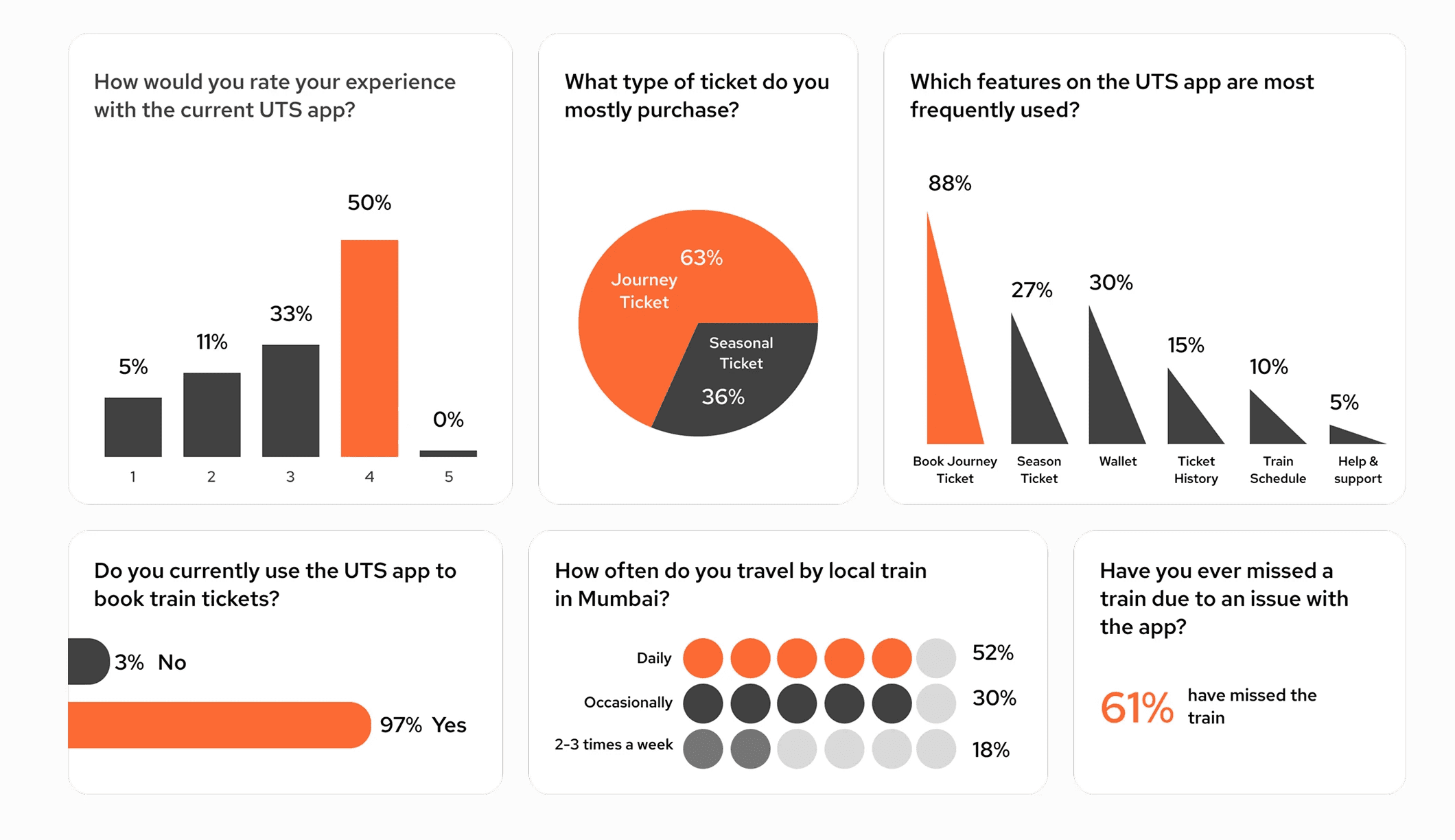
Collected quantitative insights to understand booking habits, frequently used features, and recurring pain points among daily commuters.
Secondary Research
App Review
Play Store & App Store
Analyzed user reviews to validate interview findings
and identify recurring complaints at scale.
Community Forums
Quora & Online Discussions
Explored commuter discussions to understand edge cases, frustrations, and expectations beyond direct research.
User Insights
No clear priority: App felt cluttered, with similar-looking buttons making it unclear where to click.
Too many choices: Users felt overwhelmed by the number of options, buttons.
Login added friction: Repeated OTP login was frustrating, especially when in a hurry.
Payment lacked feedback: Users were unsure if their payment was successful.
No booking memory: Users had to search for the same routes again and again.
Survey Insights
UX Audit
Identifying friction through a UX lens
We also reviewed the app ourselves to understand the design issues behind these user frustrations
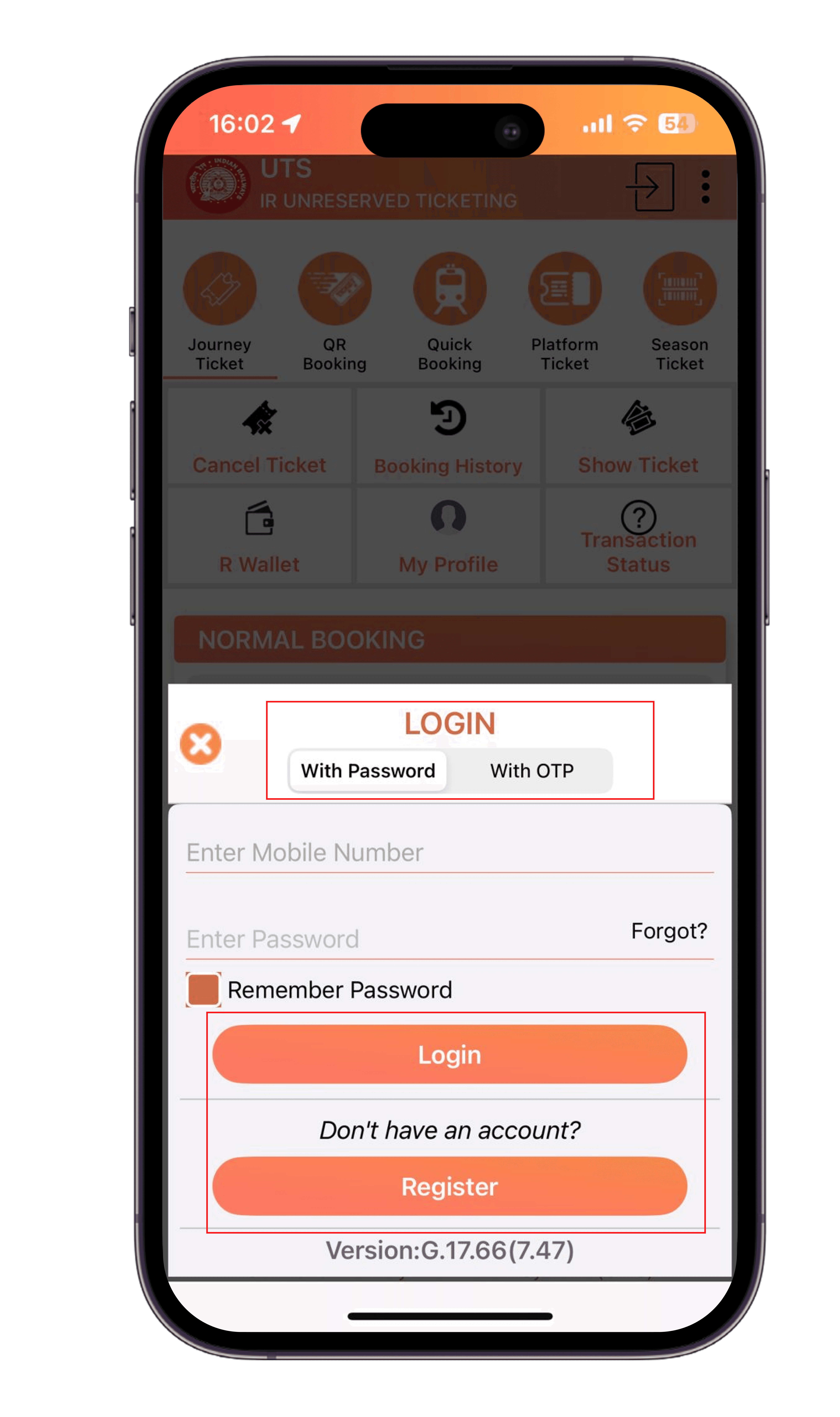
Login & Authentication
Toggle didn't look clickable. Button had equal weight, same color with
no clear primary action.

Home Dashboard
No clear hierarchy buttons and status icons looked similar, making it hard to tell what was tappable.

Journey Selection
Layout had accessibility issue, poor hierarchy, unclear labels, and no clear order.
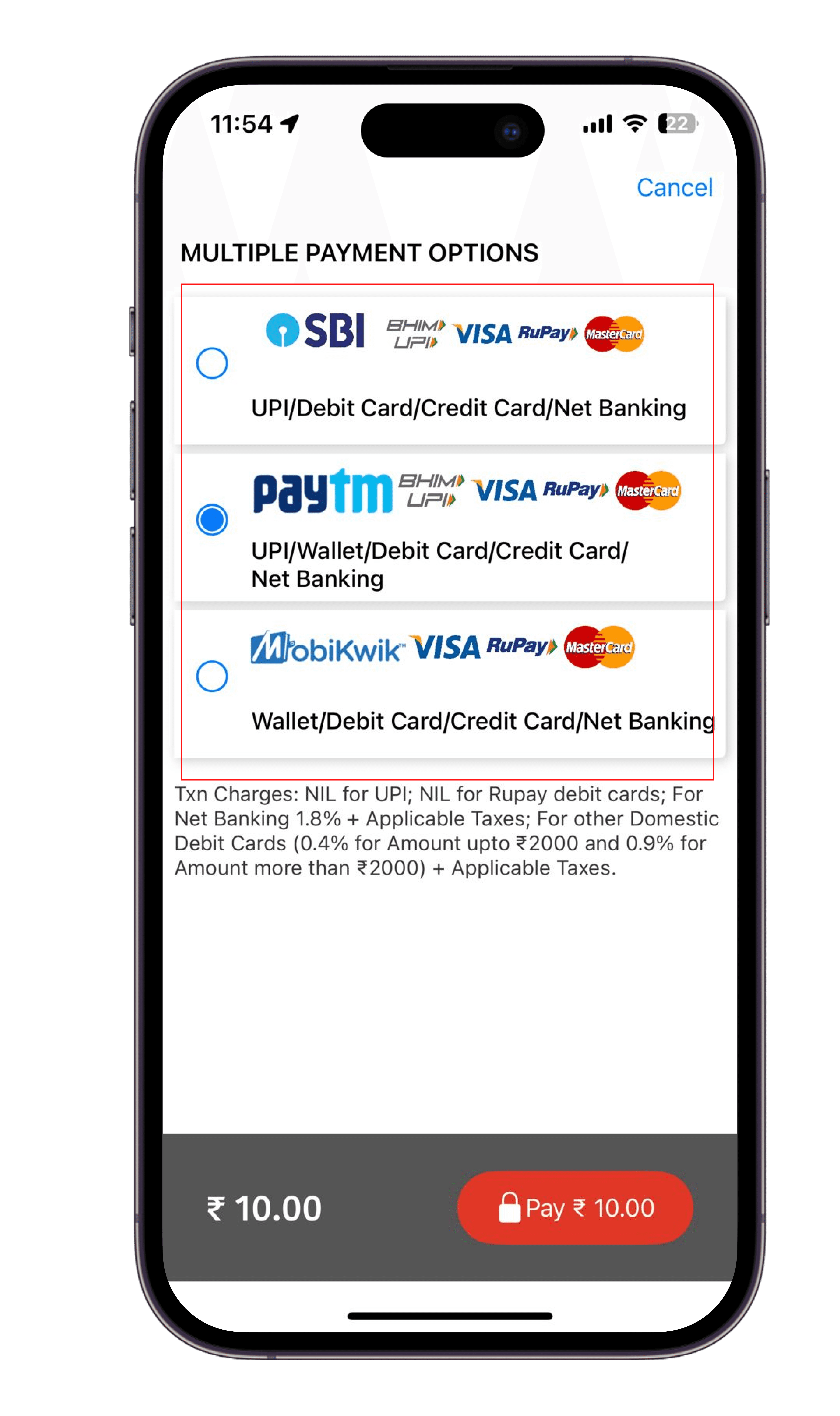
Passenger & Payment
Payment options lacked clear descriptions, making them hard to differentiate and choose.
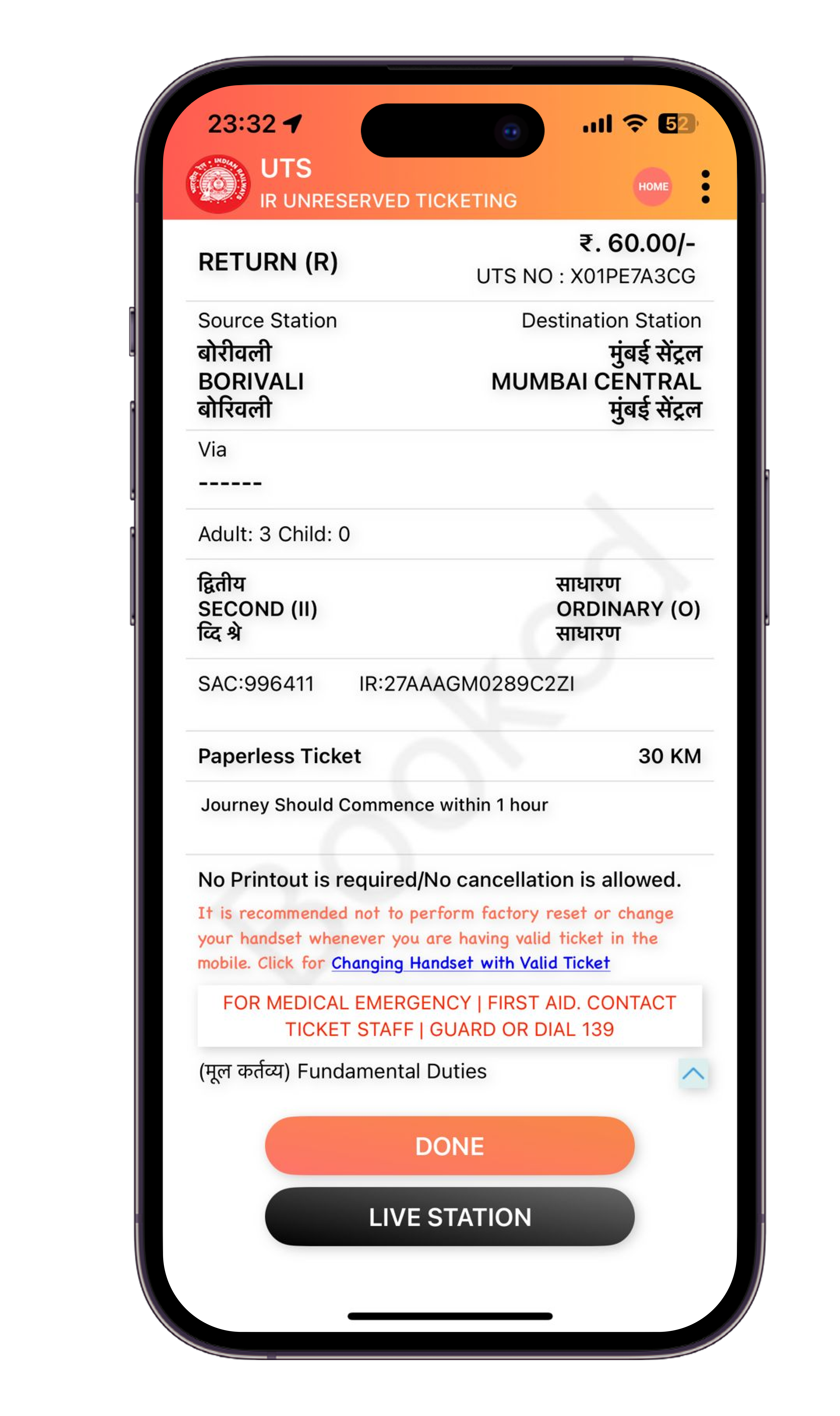
Ticket Confirmation
Essential travel information wasn't prioritized, reducing clarity after purchase.
Users could tell us where they got stuck the audit told us why?
Defining Commuter's Pain points

Confusing navigation, no clear next step
Login interrupting every time you open app / book ticket
Repetitive manual entry for frequent routes
Cluttered screens, hard to scan quickly
Unclear payment feedback
Useful features hidden where no one could find them
Ideation
HMW reduce friction from ticket booking flow ?
HMW simplify the booking flow and easy to navigate to?
HMW save people from re-entering the same trip daily?
HMW make payment options clear so users feel confident?
HMW make screens easier to scan, not clutter them?
HMW surface useful features instead of hiding them?
Turning Insights Into Direction
No clear next step →
Login breaks the flow →
Repeated route entry →
Screens feel cluttered →
Unclear payment status →
Useful features are hidden→
Making ticket booking primary action with proper navigation
Made the login experience faster and less disruptive.
Added Quick Rebooking and Saved Journeys for one-tap access
Simplified the layout with clear grouping, spacing.
Added a clear Pay Now action and a confirmation screen after payment.
Made settings features more visible and accessible.
Applying Design Principles
Prioritized Hierarchy
Improve accessibility
Building Trust
Reduce cognitive load
Prioritize frequent tasks
Reduce booking time
Solution
Redesigning the Booking Experience
Since ticket booking is the primary function of the UTS app, every design decision
focused on making this journey faster, accessible ,simpler and easier to complete.
Simplifying the Booking Flow


Repetitive Actions
No review before payment
High Cognitive Load
Longer Booking Time
High Decision making process
Eliminated repetitive route
selectionReduced booking steps
Faster ticket booking
Simplified the booking process
Reduced cognitive load
Clearer task progression
Eliminated repetitive route selection
Users Mentioned "I travel the same route every day, but I still have to
enter everything again booking takes longer than it should."
Reducing repeated actions
→ Introduced Quick Rebooking (Recent Journeys) to make frequent trips faster and reduce steps.

Users Mentioned "There are too many options on the screen. I wasn't sure where to begin"
Bringing Clarity to the Home Screen
→ Made "Book Ticket" the clear, primary action everything else takes a back seat.
→ Grouped fields logically, showed only what's needed at each step.

Users Mentioned "Too many fields, it already picked things for me before I even decided."
Clear Information Hierarchy
→Removed pre-selected defaults so users make an active choice and grouped fields clearly along with ticket summary for confirmation

Users Says "The options all looked the same, I couldn't tell which one to pick."
Simplifying Payment Options
→Separated payment into its own step after journey details.
Grouped options clearly by method instead of cramming in single form


Users Mentioned "The payment process felt unclear and confusing, No feedback
after payment"
Making Payment Feel Trustworthy
→Added clear success/failure feedback after payment, along with ticket details confirming the booking.

Usability Testing
Validating the Redesign
→We tested the new flow with real commuters completing a full booking task, start to finish,
and tracked results using Maze.


Easier to navigate
Less overwhelming
More confidence
Better readability
What Users said:
"This feels much easier than the current app."
"I immediately knew where to click."
"Quick Booking would save me a lot of time."
9 → 4 steps
Reduced booking flow

85.7%
Task Success Rate
67%
Were able to access to language settings
4.2/5 → 4.8/5
Projected rating jump
Key Takeaways
The biggest win was reducing friction in a task users repeat often. Sometimes, good design is simply making existing features easier to find and use.
Future Opportunities
Quick Access to Active Ticket
Participants wanted the active journey ticket to be visible on the home screen, enabling them to quickly present it during ticket inspections without navigating through multiple screens.
