Myntra
Redesigning Myntra's Wishlist
Helping Shoppers Decide, Not Just Save

Role
UX Researcher + Interaction Designer
Duration
48 hrs
Tools
Figma , Figma AI, Claude design
The challenge
Pick any existing product, find a genuine problem in it, and design
a solution in 48 hours.
I picked Myntra because I already had a problem with it, I kept saving things to my wishlist and then losing track of them.
Initial problem statement
How I started ?
" I save things I want to buy, but I can't find them again once my wishlist
gets crowded so I end up not buying them at all."
Research
Was This Just Me, or a Real Problem?
Conducted survey with 10 people who frequently shop online to understand how they use and return to their wishlist.
📌 Insights: Two clear patterns
People do lose track of what they save
Most had 200+ items sitting in their wishlist
8/10 had gone back for something & found it out of stock
People struggle to choose between similar saved items
Has to re-check size, fit or size chat details
Manually Compare products side by side or ask friend
UX Audit
Went Back to Understand the Problem
Wishlist page
Can a user find a saved product easily?
248 items, dumped in one list, no separation
Does the wishlist help narrow things down at all?
Chips exist but selecting one still leaves
32+ items
Is out-of-stock handled clearly?
Separate tab that shows list of out of stock products.
How are products actually listed?
Grid layout- image, name, price. Recent saved at top.
Can I find the product information quickly?
Only price and ratings are shown on the card,
Fits, reviews, return are hidden

📌 Gaps Identified from Audit
The wishlist feature doesn’t help turn that intent into a purchase.
There’s no real support for deciding between similar products.
Chips narrow /sort the list but don't help in finding a specific product.
Where Users Dropoff

Defining Problem
What Audit told me - "Myntra helps you save products, but not find or decide once added in wishlist"
Compared my insights and survey to understand what deciding actually look like?
What I noticed while buying
✓ Read the reviews
& ratings
✓ Check the fit/size
✓ Check Quality
✓ Real Pictures/ videos
✓ Making the right choice between products
What the survey told me
✓ Finding a product
✓ Deciding between products
✓ Rechecking Reviews
✓ Recheck customer photos
✓ Stock Availability
"find" and "decide" weren’t two separate problems. They're actually one path, with two points users dropped off.
"Turns out my assumption was only half right"
Reframing Problem Statement
Initial problem : Sorting problem → Better filters → Better categories → Done
Reframed problem : Find → Run into similar options → Decide → Buy
Users don't just struggle to find a product in their wishlist. They struggle to find it,
decide between similar saved options, and make decision that converts into a purchase.
Ideation
HMW help people find products from their wishlist with less effort?
HMW make finding a saved product as easy as just typing what you remember about it?
HMW help users decide between similar saved products without redoing all their research manually?
HMW help users trust a recommendation without having to read every review themselves?
HMW help users compare their top choices as easily as they compare two tabs open side by side?
HMW turn "saved" into "bought" by removing the effort that happens right before the decision?
Exploring Concepts


UX Audit
How Myntra Uses AI in Shopping
Maya AI Assistant
How does Maya reply when you ask
for something?
Maya replies a visual carousel with brief
product details.
Can Maya access the wishlist?
No. She only access the live product catalog
How is she actually helping the user?
Mostly narrowing a search, asking follow-up questions
Can she help with decision-making?
No. Shows product options in a visual collage, with
details available on click.
Can she provide any kind of summary?
Only a generic product description
Where do users find Maya in the app?
Maya is tucked inside Search bar.
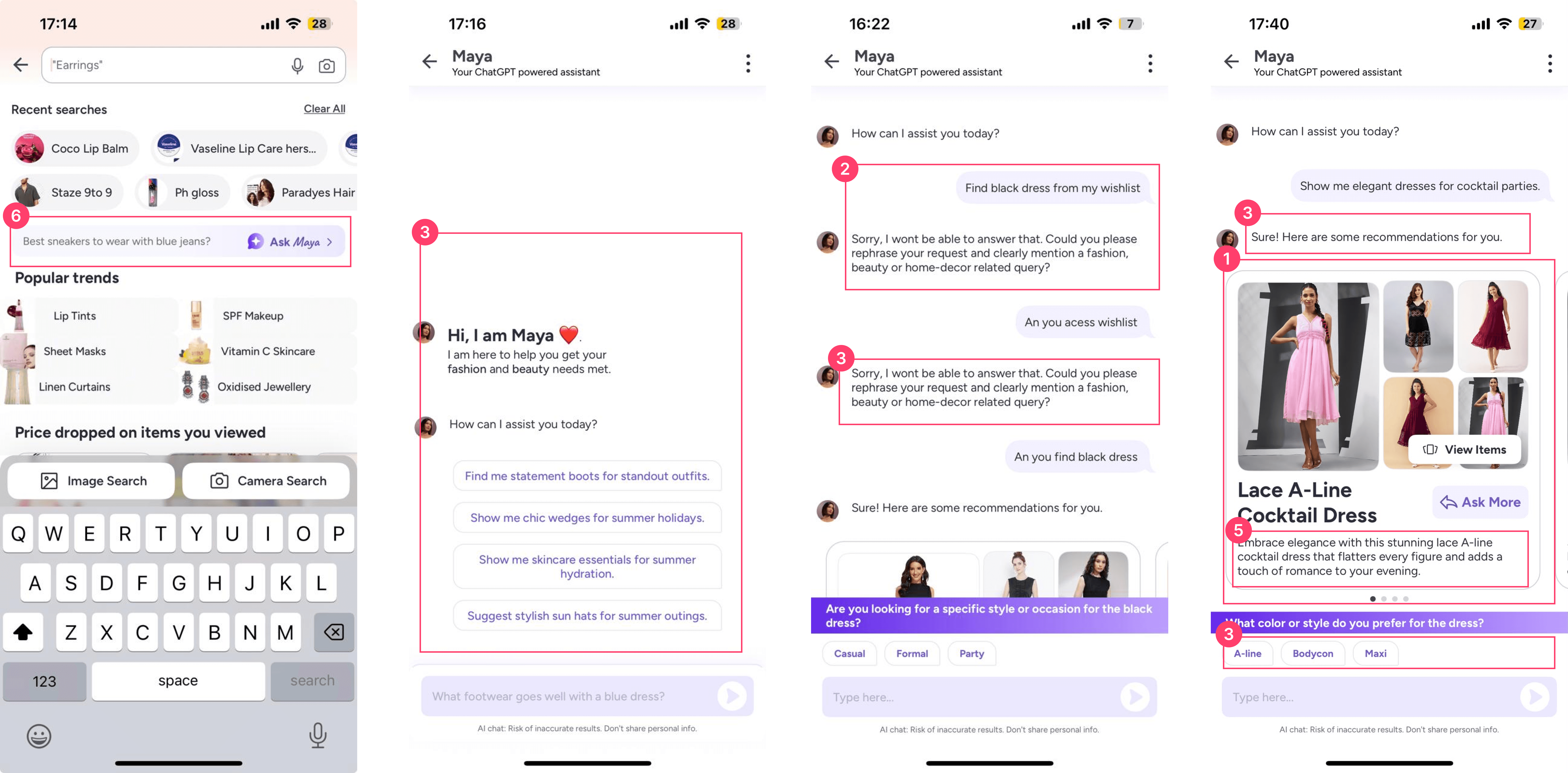
📌 Insights from Audit
Maya can recommend from product catalogue, and not from the wishlist.
Maya generates product details, but doesn't summarise customer reviews.
Maya suggest products, but doesn’t help users decide or choose the products.
Competitor Study
How others use AI for recommendation

Zomato
A collage layout mixing real photos, ratings, and
context reads as a summary, not a plain list.

Nykaa
The recommendation-summary idea AI distilling
reviews into a takeaway

Lenskart
Products are shown in a swipeable carousel.
AI provides product details and fit information for each item (verbally)

Amazon
A summarized layout combining product details, ratings,
and reviews helps users quickly compare and choose.

Amazon
A summarized layout combining product details, ratings,
and reviews helps users quickly compare and choose.

Amazon & Nykaa
AI-generated customer review summary for quick
takeaway
Design Decision
❌ Dropped the plain text summary
✅ Kept summary in chips for quick reading (Nykaa)
❌ Dropped a PLP style listing
✅ Kept Collage Layout and carousel (Zomato) (Myntra)
❌ Dropped product listing on the basis of latest - earliest
✅ Ranked on the basis of customer choices and ratings (Zomato)
❌ Dropped Product summary
✅ Kept summary of customer review on product (Amazon)
❌ Dropped chips style extra filters
✅ Reused Myntra’s existing search bar with AI assistnace (Myntra)
❌ Replaced Add to Cart button
✅ Added compare button help users compare
Solution
Landing on the Concept


How the Concept Works (Giving Maya a New Job)
Extended Myntra'a AI Asistant (Maya) from a product recommendation assistant to decision layer
within wishlist helping users understand, shortlist and compare saved products.
Maya fetches saved products from the wishlist
Summarises customer feedbacks, reviews, ratings and details into simple points for users scan quickly.
Creates collage of multiple product images and real customer photos to give better context.
Ranks product using customer ratings, reviews and sentiment, with tags to make differences easier to spot.
Compare button to compare products and see differences side by side.
Wireframes
UI Exploration

Final UI Screen - Prototype Link


The Thinking Behind the Concept ?
Why reuse Maya - AI assistance specifically ?
The audit showed Maya could recommend products , just not from the wishlist. That gap made it obvious fit. Bringing her into the wishlist meant finding and deciding could finally live in one flow, using something users already trusted, instead of building something new.
Why AI based Search bar ?
AI felt like the better fit because users could simply type what they want instead of going through multiple filters and steps.
Why summarize reviews, not product details ?
Survey showed that users rely on customer feedback before buying , so taking inspiration from by AI review summaries from Amazon and Nykaa, I prioritised review insights over basic product details.
Why chips, not full text summary?
Chips give the same takeaway in a glance no reading required making it less time consuming and boring.
Impact I'd Expect
Fewer steps to find by replacing manual sorting through chips and collections with search.
Faster decisions through AI-generated review summaries instead of reading reviews one by one.
Less drop-off at the decision stage by helping users act when their purchase intent is highest.
Fewer avoidable returns by highlighting fit and return-related feedback before purchase.
What Else I'd Explore
Auto-Generated Collections
Turning AI search results into a Collection in one Tap.
Instead of manually selecting , sorting one product at a time using the grouping Maya created during search and adding in the collection.
Inspired by Pinterest -save now, come back to a ready-made list when it's the right moment to decide
Smarter Out-of-Stock Suggestions
Right now, out-of-stock items get generic "similar" suggestions that don't really match.
Instead use AI to find exact size, fabric, and price of that item and suggest real alternatives same size available, similar price, similar delivery time so the user gets a real option instead of just losing the product.